
Accent Walls: What They Actually Do to a Room's Proportions

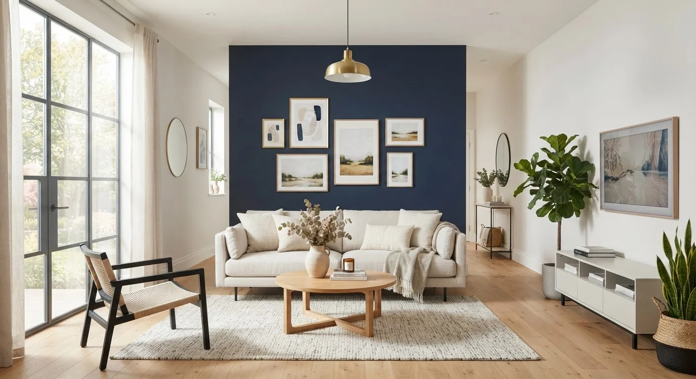
Photo: FaqsBay.com | Trending Blogs, Top Genres editorial
Key Takeaways
- A dark accent wall on a far wall makes a room feel shorter and more intimate.
- A dark accent wall on a side wall can make a narrow room feel even narrower — placement matters.
- Light or cool-toned accent walls on a far wall can visually push it back, adding perceived depth.
- The wall you choose to accent should have a reason — ideally the room's natural focal point.
- Accent walls work in any budget range; paint is the most accessible option.
- Finish type on an accent wall affects how it reads under different lighting conditions.
Why One Wall Changes Everything
Walk into a room and your brain immediately begins mapping the space — estimating its depth, width, and height within seconds. Most of that calculation happens based on visual cues: contrast, shadow, and where the eye is drawn to rest. An accent wall interrupts the uniform read of a room and gives perception something to anchor to.
When all four walls are the same color and finish, the room's boundaries dissolve into each other. The brain has to work harder to judge distance, and rooms can end up feeling either featureless or simply forgettable. A single wall treated differently — even subtly — creates a clear foreground-background relationship that makes the room feel more three-dimensional.
This is why an accent wall isn't purely a decorating flourish. It's a spatial tool. Used intentionally, it can address real problems: a room that feels too long, too narrow, too tall, or too shallow. Understanding why a room feels off is often the first step toward knowing which wall to treat and how.
The Spatial Effects of Color and Placement
The most reliable rule in accent wall design is also the most counterintuitive: darker colors on a far wall make a room feel smaller, not larger. A deep, saturated hue visually advances toward the viewer, compressing perceived distance. In a long, narrow hallway or an overly stretched living room, this compression is actually desirable — it pulls the far wall forward and makes the space feel more proportional.
The reverse is also true. A cool, pale, or low-saturation treatment on a far wall pushes it back visually, adding the impression of depth to a shallow room. This is why interior designers frequently recommend lighter tones for the wall opposite a room's main entry — it opens up the perceived length of the space before you've moved a single piece of furniture.
Placement is just as important as color. A dark accent on a side wall in a narrow room will tighten that dimension further, making the space feel more like a corridor. If narrowness is already a challenge, focus your accent treatment on the short ends of the room instead. For rooms with low ceilings, a vertically oriented treatment — tall board-and-batten paneling, for instance — draws the eye upward and adds perceived height.
1 wall
Minimum surface area needed for full spatial impact
Interior design principle: treating a single surface differently is sufficient to establish a room's focal point and shift spatial perception.
~$50–$100
Typical paint cost for a single accent wall
General estimate based on average wall size and standard interior paint pricing; costs vary by region, paint quality, and wall condition.
3:1
Ratio of untreated to treated walls for focal effect
A common interior design guideline holds that one treated wall against three neutral walls creates the clearest, most intentional contrast.
Finish choice also plays a supporting role. A matte finish absorbs light and grounds the wall visually, reinforcing its role as a backdrop. A higher-sheen finish reflects light and can subtly activate the wall, making it feel closer and more dynamic. For a full breakdown of how finish types behave, see paint finish types decoded.
Choosing the Right Wall — and Knowing When to Stop
The most effective accent wall is one that already has a reason to be the focal point: the wall behind a bed headboard, behind a sofa, behind a fireplace, or directly across from the room's main entry. These are the walls your eye naturally gravitates toward. Reinforcing that instinct with a visual treatment feels coherent rather than arbitrary.
Avoid treating a wall that's broken up by multiple doors, windows, or built-in furniture. The interruptions fragment the effect and the result tends to look patchy rather than intentional. Similarly, resist the urge to create more than one accent wall per room — two competing focal points cancel each other out and leave the space feeling visually noisy. If you're working with gallery arrangements, keeping gallery walls intentional becomes especially important on an already-contrasted surface.
Test Before You Commit
Budget-conscious homeowners often overlook accent walls as a high-impact, low-cost option. A single wall requires far less paint or material than a full room treatment, which makes it an accessible entry point for experimenting with color or texture you wouldn't commit to room-wide. For renters or those in transitional spaces, removable wallpaper panels can achieve the same spatial effects without permanence. Many of the common decorating myths that waste money involve avoiding bold choices — an accent wall is one place where restraint in scope actually enables boldness in execution.
Beyond Paint: Texture and Material as Accent
Color isn't the only way to distinguish a wall. Texture and material contrast can achieve the same spatial anchoring without adding saturated color at all — which makes them useful in rooms where the color palette is intentionally muted or already complex.
Shiplap or board-and-batten paneling on a far wall adds dimension and shadow lines that give depth even in white or off-white. A brick veneer treatment brings warmth and visual weight without brightness. Fabric-wrapped panels soften acoustics while creating a tactile contrast from smooth drywall.
Whichever material you choose, the underlying principle remains the same: contrast creates perception. The wall reads differently from its neighbors, the eye anchors to it, and the room's spatial story becomes clearer. Pair that intentional focal point with layered lighting — moving beyond a single overhead fixture — and the accent wall's effect becomes significantly more dynamic, since light plays across texture and color in ways that a single ceiling fixture will flatten.
The most useful way to think about an accent wall isn't as decoration but as a proportional correction. It's a relatively small commitment — one wall, one treatment — that does real spatial work in a room.
Frequently Asked Questions
The content provided on our blog site traverses numerous categories, offering readers valuable and practical information. Readers can use the editorial team’s research and data to gain more insights into their topics of interest. However, they are requested not to treat the articles as conclusive. The website team cannot be held responsible for differences in data or inaccuracies found across other platforms. Please also note that the site might also miss out on various schemes and offers available that the readers may find more beneficial than the ones we cover.