
Gallery Walls That Don't Look Chaotic

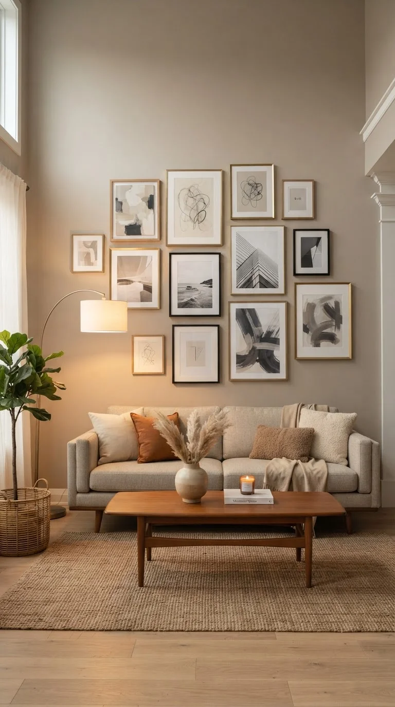
Photo: FaqsBay.com | Trending Blogs, Top Genres editorial
Key Takeaways
- A unifying element — color, frame finish, or subject matter — keeps mixed pieces visually coherent.
- Mapping your layout on paper or the floor before nailing anything prevents costly mistakes.
- Consistent spacing between frames, typically 2–3 inches, is the biggest factor in a polished result.
- A strong anchor piece at center or eye level gives the eye a natural starting point.
- Gallery walls can work in small spaces when frames are scaled appropriately to the wall.
Why Gallery Walls Go Wrong
A gallery wall fails for one of two reasons: either the pieces have nothing in common, or the spacing and scale are inconsistent. The result is a wall that reads as a jumble of afterthoughts rather than a deliberate display. The fix isn't buying new art — it's applying a few structural principles before anything goes up.
The same instincts that make a room feel pulled-together apply here. Just as mixing wood tones thoughtfully requires a unifying logic rather than random variety, a gallery wall needs an organizing idea that holds the collection together even when the individual pieces differ.
If you're working with a smaller wall or a compact room, proportional scaling becomes even more critical. Our décor principles for small spaces covers how to keep a display from overwhelming a room that can't absorb visual weight the way a larger space can.
What you will need
What You'll Need
Gather everything below before starting. Having the right tools on hand — particularly the paper and painter's tape — makes the planning stages significantly easier and reduces the chance of unnecessary wall damage.
Measuring tape
Measures wall dimensions and ensures consistent spacing between frames.
Painter's tape
Marks frame positions on the wall for a no-commitment preview of the layout.
Kraft paper or newspaper
Used to trace frame outlines and create templates for planning the arrangement.
Level
Keeps individual frames and the overall arrangement straight on the wall.
Hammer and picture hooks
Secures frames to the wall at planned positions.
Pencil
Marks hook positions transferred from paper templates before hammering.
Command strips or adhesive hooks
An alternative hanging method for renters or walls where nails aren't permitted.
How to Build a Gallery Wall That Holds Together
Follow these steps in order. The planning stages — especially the floor layout and paper templates — take longer than the actual hanging, and that's exactly as it should be. The time invested before the first nail goes in is what separates a polished gallery wall from a chaotic one.
Define your unifying principle
Before selecting what goes on the wall, decide what holds the collection together. Without at least one shared element, even beautiful pieces read as clutter. Common unifiers include:
- Frame finish: All black, all natural wood, or all metal — matched frames impose order regardless of what's inside them.
- Color palette: Artwork that shares two or three recurring hues will feel curated even in mismatched frames.
- Subject or theme: Botanical prints, family photos, architectural drawings — a consistent subject creates cohesion.
You can mix two unifiers (say, black frames with a warm-toned palette), but adding a third usually tips the display toward chaos. Settle on your anchor principle first, then edit your pieces against it.
Measure the wall and set a boundary
A gallery wall needs defined edges or it will feel like it's spreading uncontrollably. Measure the wall space you want to fill and note any fixed obstacles — light switches, outlets, or sconces. Then establish a rough bounding rectangle for the installation: for example, 48 inches wide by 36 inches tall above a sofa.
As a general rule, the gallery should span roughly two-thirds the width of furniture below it (a sofa, console, or headboard). Going edge-to-edge above a narrow sofa can overpower the piece; stopping too short leaves the arrangement looking timid.
Create paper templates and plan the layout on the floor
Trace each frame onto kraft paper or newspaper and cut out the template. Mark the hanging-hardware position on each template so you can transfer it directly to the wall later.
Lay all templates on the floor within a taped rectangle that matches your wall boundary. This is where you do the real design work — rearrange freely until the composition feels balanced. Aim for:
- Your largest or most visually dominant piece near the center or slightly left of center (the eye naturally reads left to right).
- Varied frame sizes distributed so no single quadrant feels heavy.
- Consistent gaps between templates — 2 to 3 inches is the most readable spacing for most rooms.
Transfer the layout to the wall using painter's tape
Tape your paper templates to the wall in the planned arrangement. Step back frequently — at least 8 to 10 feet — to evaluate the composition. What reads as balanced on the floor can feel top-heavy or off-center once it's vertical.
This is the moment to make adjustments before a single nail goes in. Shift templates, swap pieces, or remove an element that isn't earning its place. A gallery wall that looks intentional usually has at least one piece that was removed during this stage.
Mark hook positions and hang frames
Once you're satisfied with the template layout, mark the hook position through each paper template directly onto the wall using a pencil. Remove the templates one at a time and drive the hook or nail at the marked point before moving to the next frame.
Hang frames in a logical sequence — start with the anchor piece at center, then work outward. Use your level on each frame as you go. Re-check spacing with your measuring tape rather than eyeballing; a half-inch inconsistency is more noticeable than most people expect.
Step back and edit
Once everything is hung, live with the arrangement for a day before declaring it finished. Lighting at different times of day can reveal imbalances you didn't notice during installation. A piece that looked right in morning light might feel too dark in the evening.
If something feels off, trust that instinct — it usually means a frame needs to shift, a piece needs to be swapped out, or the spacing needs a small correction. Gallery walls are meant to evolve, so don't treat the first hang as permanent.
Start Smaller Than You Think
Scale Matters More Than Quantity
Keeping the Display Intentional Over Time
A gallery wall is never truly finished — it should shift as your tastes and collection evolve. When you add a new piece, evaluate it against the unifying principle you established in Step 1. A single frame in a clashing finish or a dramatically different scale can undermine the whole composition.
Before making any significant changes, it's worth running a broader room assessment. Our room refresh checklist can help you evaluate whether the gallery wall adjustment is part of a larger need the room has, or simply a targeted update.
Check Wall Type Before You Hang Anything
And if you're drawn to the idea of making the wall itself a design element — not just the art on it — compare what a gallery wall achieves versus what a painted accent wall does to a room's proportions. The two approaches work differently on spatial perception, and understanding that difference helps you choose the right tool for the effect you're after.
The content provided on our blog site traverses numerous categories, offering readers valuable and practical information. Readers can use the editorial team’s research and data to gain more insights into their topics of interest. However, they are requested not to treat the articles as conclusive. The website team cannot be held responsible for differences in data or inaccuracies found across other platforms. Please also note that the site might also miss out on various schemes and offers available that the readers may find more beneficial than the ones we cover.